Over Time graphs
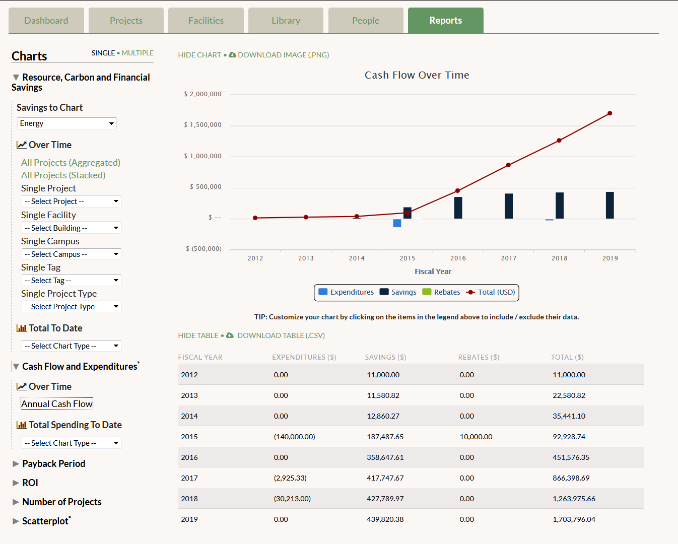
- Annual Cash Flow: This graph displays all the Project Expenditures, Financial Savings, and Project Rebates that occur each fiscal year. The red line is the total number, negative or positive, that this sums to each year. This shows whether you spent or saved more money that fiscal year.
Total Spending To Date graphs
- Total Spending by Facility: This graph displays money spent on projects in each building entered in GRITS. Only projects with Project Expenditures that are marked as Completed or In-Progress will be included in this graph. If a single project was done across multiple buildings, the expenditures are divided equally among those buildings. In future versions of GRITS, users will be able to assign specific expenditures (costs) by building. Click on “Show Pie” to view it as a pie chart instead of as a bar graph.
- Total Spending by Tag: This graph displays money spent on projects linked to each tag you’ve created. Only projects with Project Expenditures that are marked as Completed or In-Progress will be included in this graph. If a single project has multiple tags, the expenditures are divided equally among those tags. In future versions of GRITS, users will be able to assign specific expenditures (costs) by tag. Click on “Show Pie” to view it as a pie chart instead of as a bar graph.
- Total Spending by Campus/Site: You’ll only see this option if you’ve created more than one campus/site. This graph displays money spent on projects in each campus/site entered in GRITS. Only projects with Project Expenditures that are marked as Completed or In-Progress will be included in this graph. If a single project was done across multiple campuses, the expenditures are divided equally among those campuses. In future versions of GRITS, users will be able to assign specific expenditures (costs) by campus. Click on “Show Pie” to view it as a pie chart instead of as a bar graph.
- Total Spending by Project Type: This graph displays the total money invested by types of projects, such as HVAC, Lighting, Renewables and Alternative Energy, and Water. Only projects with Project Expenditures that are marked as Completed or In-Progress will be included in this graph. If a single project has multiple Project Types, the expenditures are divided equally among those types. In future versions of GRITS, users will be able to assign specific expenditures by Project Type. Click on “Show Pie” to view it as a pie chart instead of as a bar chart.
*Note on campus currencies: All financial information presented here is converted to your institution-level currency (if any projects with a custom campus currency are included).