After adding one or more projects to your scenario, the Scenario page will reload. In the chart at the top of the page you’ll now see the projected impact of your scenario projects on your annual emissions or resource consumption rate. Several elements appear in the chart:
- Baseline: The amount of annual emissions or resource consumption at the beginning of the goal period.
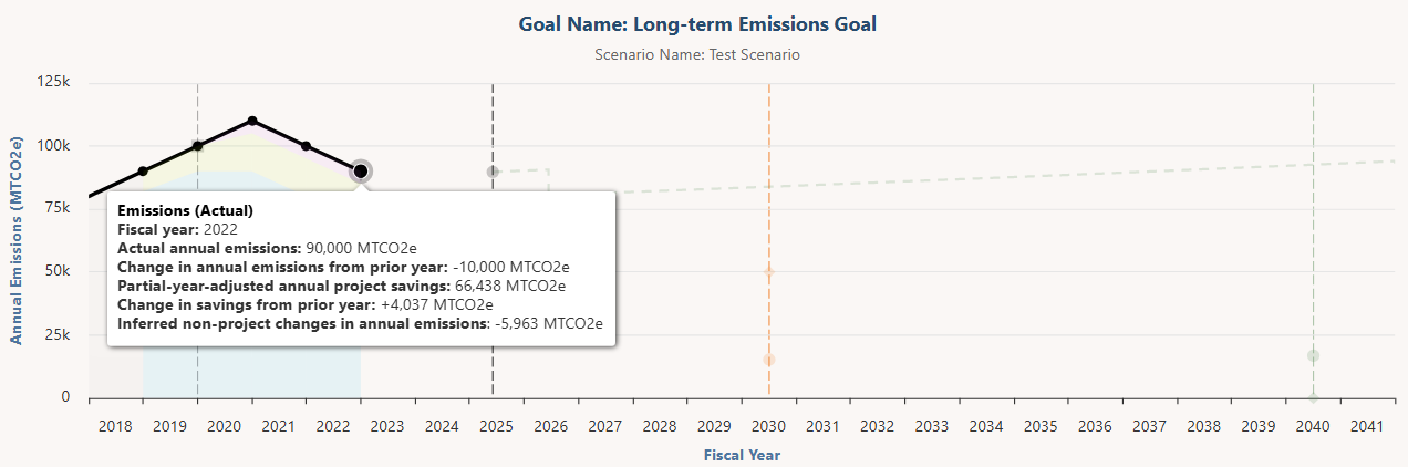
- Actual emissions or resource consumption: The past (measured) amount of annual emissions or resource consumption at this scenario’s scale (institution-wide, one particular campus/site, or one particular facility). This data is pulled from the Consumption tab when it is available, and it appears as a solid black line. When this data isn’t available, the chart displays a dotted black line to indicate a projection, and it appears at the level of the goal’s baseline. The chart shows past data for up to two years prior to the baseline.
- Emissions by scope: This chart element only appears for emissions reduction scenarios. These are color bands that appear below the actual emissions line and indicate the portion of scope 1, 2, and 3 emissions that make up the overall carbon footprint. You can see how each individual emissions scope is changing over time. When sufficient scope data isn’t available, this element appears as a gray area. Color bands in a particular fiscal year only appear when 1) that year’s emissions data is broken down into underlying scopes on the Consumption tab, 2) the years immediately before and after it are also scope-defined on the Consumption tab.
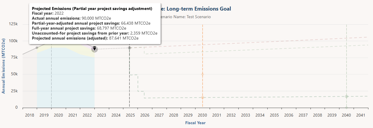
- Projected emissions or resource consumption (Partial year project savings adjustment): This chart element only appears if a past project with savings relevant to your scenario was completed partway through the last fiscal year for which measured consumption data is available. For example, consider a project completed on the last day of the last measured fiscal year. Because only a portion of this project’s savings are going to impact that year’s consumption inventory (just one day’s worth of savings in the example), this chart element adjusts the position of the past projection to account for the remainder of unaccounted-for savings.
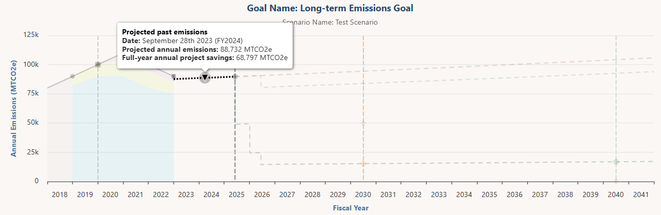
- Projected past emissions or resource consumption: A projection that begins from the last consumption data point (after adjusting for the unaccounted-for savings described in the prior bullet) and shows how annual emissions or resource consumption is expected to change up to today’s date. It grows according to the user-defined growth rate. All In-Progress and Completed projects with relevant savings that have a complete date during this period are factored into this projection, regardless of whether they have been added to the scenario or are just “background projects” outside of it. Proposed projects in an implemented plan that meet those same criteria are also factored in. Yesterday’s date is the end of the projected past line, and all future projections begin afterward (on today’s date). This projection appears as a dotted black line.
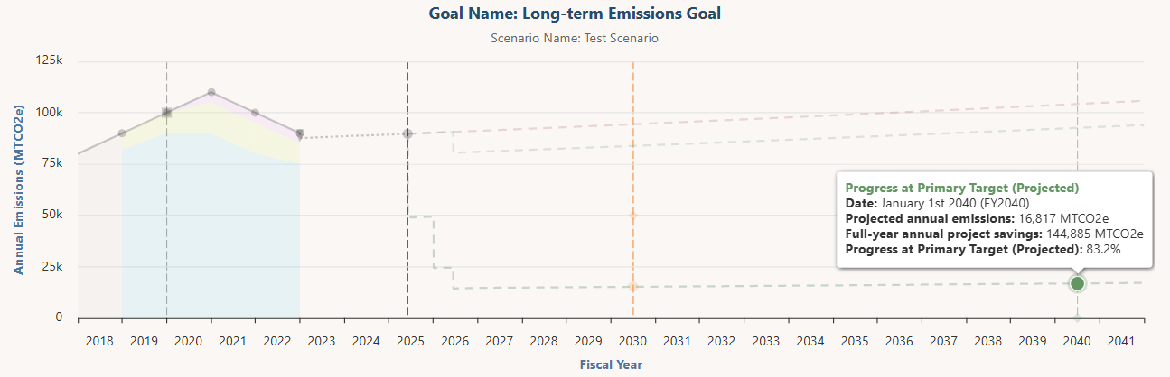
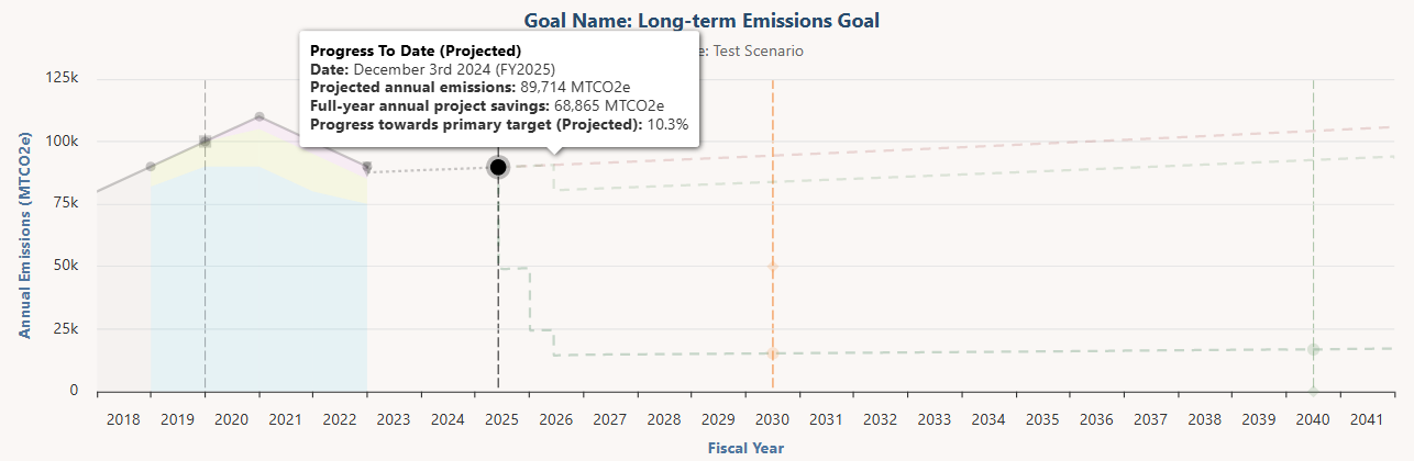
- Progress to date (Projected): The projected annual emissions or resource consumption on today’s date.
- Business as usual (Unmitigated): A projection showing how annual emissions or resource consumption would change from tomorrow’s date if no sustainability projects were implemented. This projection grows according to the user-defined growth rate. It appears as a dotted red line.
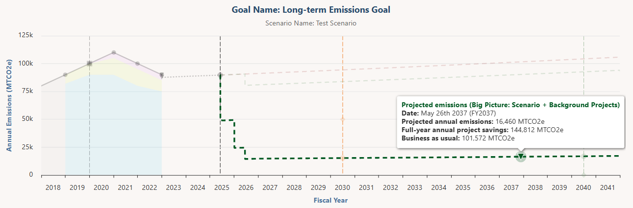
- Projected emissions or resource consumption (Big Picture: Scenario + Background Projects): A projection showing how annual emissions or resource consumption would change when accounting for all projects that save the resource targeted in this scenario. This projection adds together the projects in this scenario and “background projects” that are not part of it, as long as they reduce the targeted resource after the baseline date and occur at the same scale (i.e. they belong to the same campus or building for campus- or building-level goals). All projects that match these criteria in any implemented plans are included (even Proposed projects), and so are all In-Progress and Completed projects in the Candidate Projects list below (which don’t currently belong to any plans). This projection grows according to the user-defined growth rate. It appears as a dark green dotted line. If there are no background projects, then this projection won’t appear.
- Projected emissions or resource consumption (Scenario Projects Only): A projection showing how annual emissions or resource consumption would change if the scenario projects are implemented. Project savings kick in according to the schedule set in the Project Timeline section. The savings of each individual scenario project in each fiscal year can be found on the Chart Data Table sub-tab. This projection grows according to the user-defined growth rate. It appears as a light green dotted line.
- Projected emissions or resource consumption (Background Projects Only): A projection showing how annual emissions or resource consumption would change if the background projects are implemented. Project savings kick in according to the completion date of each background project. The savings of each individual background project in each fiscal year can be found on the Chart Data Table sub-tab. This projection grows according to the user-defined growth rate. It appears as a light green dotted line. It is switched off by default on the Chart Settings sub-tab, and also won’t appear if there are no background projects.
- Intermediate Target: A milestone target for annual emissions or resource consumption between your baseline and primary target.
- Progress at Intermediate Target (Projected): The point on the primary future projection line that corresponds to the date of the intermediate target. The future projection deemed primary is as follows: If the Big Picture projection appears in the chart, it will be the primary projection used to calculate progress. If it’s not, the Scenario Projects Only projection will be used. If both of those projections do not appear, the Background Projects Only projection is used. If none of those three appear in the chart, the Business as Usual projection will be used.
- Primary Target: The ultimate target for annual emissions or resource consumption at the conclusion of the goal period.
- Progress at Primary Target (Projected): The point on the primary future projection line that corresponds to the date of your primary target. The future projection deemed primary is as follows: If the Big Picture projection appears in the chart, it will be the primary projection used to calculate progress. If it’s not, the Scenario Projects Only projection will be used. If both of those projections do not appear, the Background Projects Only projection is used. If none of those three appear in the chart, the Business as Usual projection will be used.
You can remove any element from the chart by deselecting it in the legend below the chart (though its title will remain in the legend). In addition, on the Chart Settings sub-tab you can toggle off any projections you don’t want to appear either in the chart or in the legend below. The progress metrics for your scenario may be recalculated depending on which projections are switched off. Learn more about the progress metrics and these settings here.
The tick marks on the chart’s x-axis delineate fiscal years. The space between the tick marks, where a year appears, is the span of that fiscal year (e.g. | 2030 | is the span of fiscal year 2030).
Every point on the chart projections represents the anticipated annual emissions or resource consumption rate on that day. For example, if you hover your cursor over the last day in the 2030 fiscal year, the projected emissions/consumption amount appearing there is what you should expect to emit/consume over the course of the year ending at that point (the full 2030 fiscal year).
The chart assumes that once any level of resource reduction has been attained, those savings will be maintained by replacing expiring equipment with its equivalent. This assumption means that when a project expires, the projected emissions/resource consumption line doesn’t increase to where it was prior to the project’s installation.
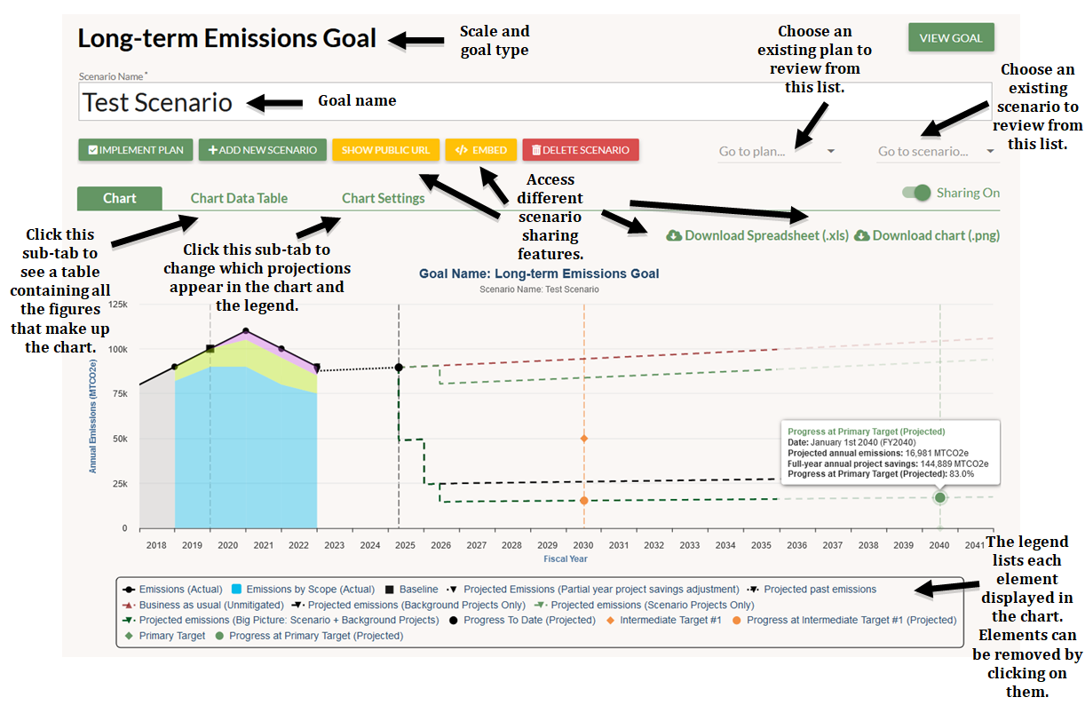
Hover your cursor over the chart elements to get more information.
The chart bubbles that appear above the Actual Emissions/Resource Consumption line include:
- Fiscal Year
- Actual emissions/Actual resource consumption: The past (measured) amount of annual emissions or resource consumption at this scenario’s scale (institution-wide, one particular campus/site, or one particular facility)
- Change in annual emissions/resource consumption from prior year
- Partial-year-adjusted annual project savings: The portion of savings from projects completed in that fiscal year that would be accounted-for in the year-end measurement of emissions/resource consumption
- Change in savings from prior year
- Inferred non-project changes in annual emissions/resource consumption: The difference between the “Change in savings from prior year” figure and the “Change in annual emissions/resource consumption from prior year” figure. This calculation shows the portion of emissions/resource consumption changes that is not attributable to projects.
The chart bubble that appears above the Projected Emissions/Resource Consumption (Partial year project savings adjustment) element include:
- Fiscal Year
- Actual emissions/Actual resource consumption: The past (measured) amount of annual emissions or resource consumption at this scenario’s scale (institution-wide, one particular campus/site, or one particular facility)
- Partial-year-adjusted annual project savings: The portion of savings from projects completed in that fiscal year that would be accounted-for in the year-end measurement of emissions/resource consumption
- Full-year annual project savings: The sum of the full-year annual savings from projects that are projected to be implemented by the selected point in time
- Unaccounted-for project savings from prior year: The difference between the “Full-year annual project savings” and the “partial-year-adjusted annual project savings”
- Projected annual emissions/resource consumption (adjusted): The difference between the last actual emissions/resource consumption data point and the unaccounted-for savings figure. This is the starting point of the Projected Past line.
The chart bubbles that appear above the Projected Past line include:
- Date
- Projected annual emissions/Projected resource consumption: The anticipated annual emissions/resource consumption at the selected point in time
- Full-year annual project savings: The sum of the full-year annual savings from projects that are projected to be implemented by the selected point in time
The chart bubble that appears above the Progress to Date element includes:
- Date
- Projected annual emissions/Projected resource consumption: The anticipated annual emissions/resource consumption on today’s date
- Full-year annual project savings: The sum of the full-year annual savings from past projects
- Progress at intermediate/primary target (projected): The projected progress towards the intermediate and primary target
The chart bubbles that appear above the future Projected Emissions/Resource Consumption lines include:
- Date
- Projected annual emissions/Projected resource consumption:
- If you’re looking at the Big Picture projection, this number is the anticipated annual emissions/resource consumption at the selected point in time if the scenario projects and the background projects are implemented
- If you’re looking at the Scenario Projects Only projection, this number is the anticipated annual emissions/resource consumption at the selected point in time if only the scenario projects are implemented
- If you’re looking at the Background Projects Only projection, this number is the anticipated annual emissions/resource consumption at the selected point in time if only the background projects are implemented
- Full-year annual project savings: The sum of the full-year annual savings from projects that are projected to be implemented by the selected point in time
- Business as usual: The projected total emissions/resource consumption at the selected point in time under business as usual (i.e. if no projects are implemented)
The chart bubbles that appear above the Progress at Intermediate/Primary Target elements include:
- Date
- Projected annual emissions/Projected resource consumption:
- If the Big Picture projection appears in the chart, the progress element will intersect with it, and this number is the anticipated annual emissions/resource consumption on the target date if the scenario projects and the background projects are implemented
- If the Big Picture projection does not appear in the chart and the Scenario Projects Only line does, the progress element will intersect with Scenario Projects Only line, and this number is the anticipated annual emissions/resource consumption on the target date if scenario projects are implemented
- If neither the Big Picture projection nor the Scenario Projects Only line appear in the chart, the progress element will intersect with the Background Projects Only projection, and this number is the anticipated annual emissions/resource consumption on the target date if only the background projects are implemented
- Full-year annual project savings: The sum of the full-year annual savings from projects that are projected to be implemented by the target date (whether this number incorporates scenario projects, background projects, or both depends on which projection is being used to calculate progress, as described in the prior three bullets)
- Progress at intermediate/primary target (projected): The projected progress towards the intermediate and primary target